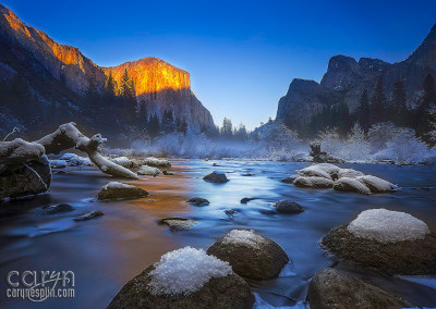
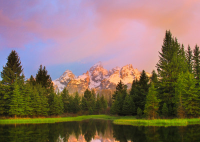
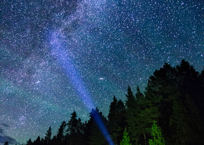
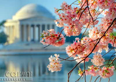
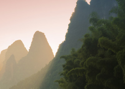
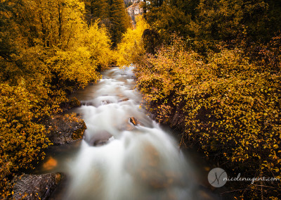
A NEW PERSPECTIVE: Capture a total of 9 quality images with the SAME subject showing up in each image. Choose a nature location and use a variety of different vantage points, angles, focal lengths, depth of field, and leading lines. Some images should be close up and some should show the whole scene from different angles. Try laying on the ground and shooting up for a new perspective. One of your images must be humanizing the landscape and one should include a texture blend. Also be sure one or two are landscapes with the subject showing in the distance.
Google it: Examples of landscape photography
Student Examples: Emily Potter, Beth Mitchell, Kiley Baker, Nathan Jones
Instructions
A. PERSPECTIVE OF 9
A NEW PERSPECTIVE: Capture a total of 9 quality images at the same nature location with completely different vantage points, angles, focal lengths, depth of field, and leading lines. Some images should be close up and some showing the whole scene from different angles. Try laying on the ground and shooting up for a new perspective.
1. INCLUDE SUBJECT IN EACH IMAGE: All images must show the SAME SUBJECT somewhere in the image. See the student Sample blog posts above.
2. WIDE LANDSCAPE WITH SMALLER SUBJECT: At least one or two of your shots should be WIDE LANDSCAPE shots where the subject is smaller in the distance.
3. HUMANIZE THE LANDSCAPE: One of your images must be humanizing the landscape. Humanizing the landscape could include a boat with people, an animal showing the scale of the scene or even a hiker to show scale and/or tell a story. Humanizing a landscape is not a portrait.
4. TEXTURE BLEND: Include the original texture image in your blog post (thumbnail size is fine) and leave a note in the process about how you blended it with one or more of your images.
DON’T FORGET TO INCLUDE THE SAME SUBJECT IN EACH IMAGE AND DON’T FORGET YOUR LANDSCAPE, TEXTURE & HUMANIZE LANDSCAPE SHOTS!
B. PHOTOSHOP PROCESSING: Process all 9 images using the tutorials from Activity 4 Photoshop Skills as needed for portfolio-quality display. Take several texture images or use a texture from a free texture website like textures.com, then use one of your texture images to blend with one of your landscape perspective images. Use the Balance the Light 5.24 Blending Tips Tutorial to try blending modes and masking for an interesting effect
C. BLOG POST
PLEASE LIST what your common subject in each photo is when you write your blog post process. Display your collage layout showing all nine images at the top of your post. Then display your written process. Finally display all nine images individually at large size, with 1080 pixels on the short side. Follow the Student Sample Blog posts at the top of this page.
Collage Layout Tips: You may use the simple method in this Balance the Light 5.16 Photo Collage tutorial for creating a collage layout of images in Photoshop. Just be sure when you are done with this tutorial, you save your full-size .psd for future editing. Then size your collage at 1080px on the short side and save it as a jpeg for your blog post.
OTHER PS LAYOUT METHOD: (a bit more time-consuming): Use a grid in Photoshop to create this collage; in Photoshop, go to View > New Guide Layout.
NOTE – NO MORE LABELS. Starting with this assignment, you no longer need to list your f/stop and shutter speed labels, etc. (metadata) in your blog post, unless you want to ;).
D. SOCIAL MEDIA SHARING: Instagram
- Post at least one of your 9 Landscape Perspectives on Instagram.
- Add your Instagram username to your introduction in our Facebook group. Go to Photos – Albums – INTROS.
- Use these hashtags: #comm300. #perspectiveof9
- Tag @visualcomm.photos on the image (not in the caption).
- Search the #perspectiveof9 hashtag and view 6+ classmates’ landscape posts.
- Like at least 6 classmates’ posts and comment on 3+ that have less than three comments
- List which 6 classmates’ post you viewed and which 3+ classmates’ Instagram posts you commented on in the comment section of your assignment submission.
5. SUBMISSION:
• Follow the Submission Process
• Submit your blog post link to the WEB URL tab on the submission section of Canvas.
• List how many classmates’ posts you liked and how many you commented on in the comment below the WEB URL.
• Example: I viewed 6+ classmates Insta posts; Commented on Lindsey Jones, Ben Harker, and Doug Phan.
• Before 9am Wednesday, choose your best photo or the collage of all your photos and add it to the correct Class Facebook album. NOTE: Go to Photos > Albums — in the left upper column of the FB Group.
CAUTION: Your assignment is not complete until you submit it here. However, you are allowed a one-time extension, if you choose to use your mulligan. (See syllabus). We check your blog post for completion right at the deadline, so please do not add things after submitting your link, until it has been graded. In accordance with Comm Dept. policy, late work will not be accepted.
Landscape Tips
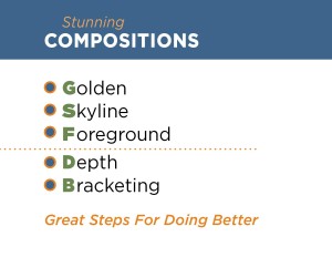
Try putting your tripod very low and bring rocks or something close into the foreground. Use a small aperture (f16-f22) to get both the foreground and the background in focus. Position yourself to capture something interesting in the foreground. Rule of thirds can also mean composing a scene so you have something in the Foreground, Midground, andBackground.
2. Stay after sunset for some long exposure blue hour shots and discover a whole new time of day for photography.
3. WARM & COOL: It’s usually a great combination to include warm and cool colors together in an image. I’m intrigued whenever I can find complementary colors in nature!
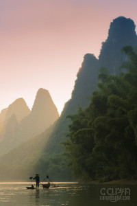
4. Show SCALE: Put a person in your landscape to show scale and also to humanize the landscape. It can also tell a story behind the image. (Example image to the right)
5. Rule of Thirds: Place key objects and lines of the landscape on the third line of your composition to create interest.
6. Sunflare: Position the sun so it’s partially blocked by a tree or something. Then, set a small aperture like f/16 or 22 and bracket the exposure.
7. Lens Compression: We usually use a wide angle lens for landscapes but try something new! Move away to get a more interesting foreground and zoom in. The lens compression from zooming brought the background subject much closer to create an interesting composition. The added bonus of zooming is you can get more wildlife since you are further away.
For more photo tips and examples, check out my Instagram @carynesplinphoto.
Rubric
NOTE: Meeting the minimum requirements is “average” and constitutes an 80% or B- grade, according to the University Grading Guide. To receive a higher grade, students should excel. However, quality and/or difficulty is more important than quantity.
√ SIZING: Photos sized to 1080 pixels on the short side. First part of jpeg filename is student’s name. Example: JakeSpencer-Tetons.jpg. Photos displayed at “Large” size in blog post, per instructions in Week 1 > Photo Blog Instructions. Photos are clickable.
√ PROCESS: Detailed paragraph (3-5 sentences) about the process. List how you blended the texture image.
√ INSTRUCTIONS: 9 quality images of the same subject with completely different vantage points, angles, focal lengths, depth of field, and leading lines. Process all 9 using the tutorials from A4 Activity. Post the original texture image too, as a thumbnail. Post the collage first, then written process and finally all 9 images at large size. Don’t forget to complete the Social Media Sharing
√ PHOTO QUALITY: Light – Focus – Composition – Creativity.
√ APPROPRIATE EDITS for professional display
√ SUBMISSION: Link submitted was a true hyperlink and linked directly to the completed blog post. Best Photo on FB before 9am on Wednesday.
CAUTION: YOUR ASSIGNMENT IS NOT COMPLETE UNTIL YOU SUBMIT A LINK TO IT HERE. However, you are allowed a one-time extension, if you choose to use your mulligan. Please read about it in the syllabus. We check your blog post for completion right at the deadline, so please do not add things later. Everything needs to be complete when you post the link.
Advanced Options, Tips & Tutorials
Google the following topics to find inspirational examples, tutorials and videos.
Attend Visual Society meetings to learn more advanced options and get inspired!
CREATING GRIDS IN PHOTOSHOP: Follow this tutorial from Smashing Magazine. Using grids will make your design flow much more easily, and helps with alignment.
CREATING A COLLAGE IN PHOTOSHOP: Follow this tutorial for help setting up a collage in Photoshop. The sky is the limit- there are endless ways you can lay yours out!
TRAVEL PHOTOGRAPHY: Self Assignment While you’re traveling, stop and take your own landscape images; find a subject, and capture at least 9 images from different points of view, focal length, etc.

